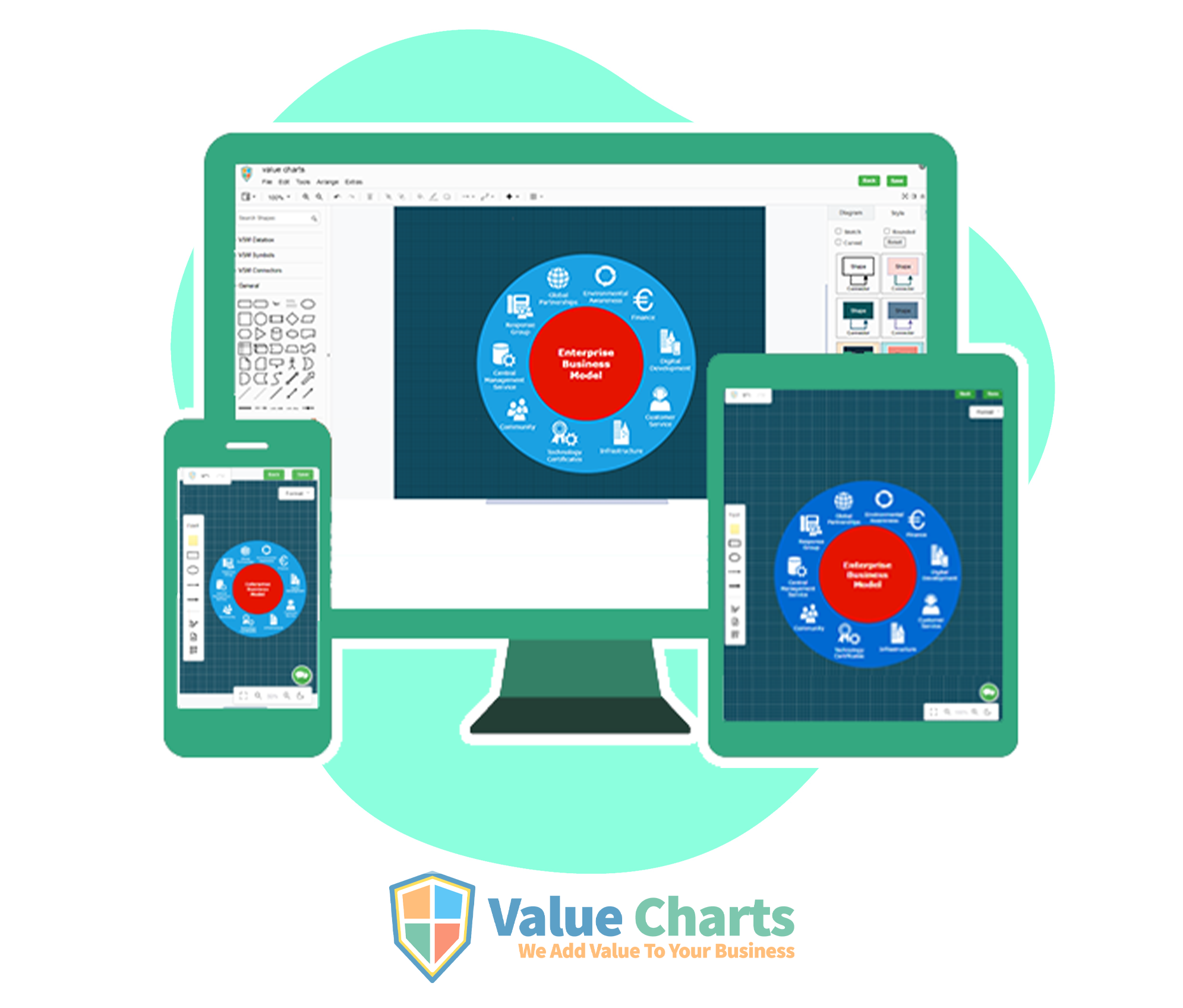
MOBILE RESPONSIVE DIAGRAMMING TOOL BY VALUE CHARTS
The design and development of our website is approached on the user’s behavior and environment base screen size , platform and orientation. Value charts has launched the first web based responsive diagramming tool to support our micro and macro industries.
The practice consists of mix of flexible grids and layout , images and an intelligent use of CSS media queries. As the user switches from their laptop to iPad, the website should automatically switch to accommodate for resolution, image size and scripting abilities. The website has the technology to automatically respond to the user’s preferences . This would eliminate the need for a different design and development phase for each new version of devices.
Its perfect for devices that switch from portrait orientation to landscape in an instant or for when user switch from a large computer screen to an iPad.
Devices such as the iPad and Android will definitely support media features.
HOW DOES A RESPONSIVE WEBSITE (RWD) WORK ?
Responsive web design has three main components media query, the web browser , and the responsive web interface itself. Responsive web design (RWD) makes sure that a websites displays at its best disregarding of its usage on its screen display size .
Responsive layouts automatically adjust and adapt to any device screen size, whether it is a desktop, a laptop, a tablet, or a mobile phone .
These are the example of how elements of a web page adapt to the screen size of different devices such as the display on a desktop computer, tablet pc an a smartphone.
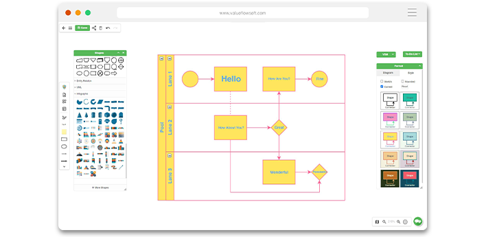
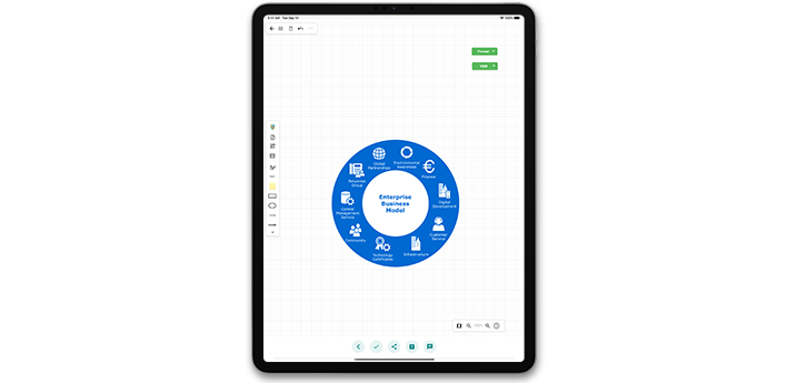
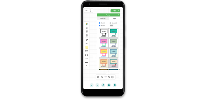
The value flow soft web based diagramming tool is designed and developed for wide range of user’s to adapt themselves on their work on comfortable devices . The tool works wonderful on all the stimulations and displays accordingly . Thus the media query using CSSꝫ features to target devices would work just fine.
- Share:


